


The Ultimate Guide to Accessible Presentation Design
As a presentation design agency, we understand the importance a good design holds in effectively reaching your audience.
There are many factors that feed into an effective PowerPoint design including hierarchy, color and image selection, and which font you decide to use.
Presentation design relies heavily on creating enticing visuals that get your message across. But for those who are visually impaired, enticing visuals may not be enough to provide an accessible presentation.
Why you should design your PowerPoint for accessibility
At the forefront of why we practice accessible design is the desire to have clients benefit fully from the presentations we create for them. A large part of being a presentation designer is knowing your audience and knowing how they are accessing your material.
PowerPoint presentations may be viewed by individuals on their personal devices, or they may be projected in large auditoriums for thousands of people. Presentation designs can easily be washed out from the light of the projector, fluorescent lights, or even natural sunlight shining into the room. Having an accessible design will make your presentation easier to see for all members of your audience, with or without visual impairments.
As presentation designers, we are responsible for staying up to date with current standards and regulations surrounding design accessibility. In recent years, tech companies have been sued for web designs that did not align with the accessibility standards set by the ADA.
In 2018, a class action lawsuit was filed against Apple for having a website that was inaccessible to the visually impaired, due to its incompatibility with screen readers. In the same year, Amazon was hit with a class action lawsuit for the same reason.
At the beginning of 2019, Beyoncé’s company, Parkwood Entertainment, was sued on the grounds that their website was inaccessible to visually impaired users and was preventing them from being able to fully access the website.
Designing with accessible practices will allow more people to enjoy your content as well as protect you from avoidable legal ramifications.
Defining accessibility
When we mention accessible graphic design, we mean designing for people with color blindness, other visual impairments, such as low vision, and motor disabilities. Below is some information to keep in mind regarding how your designs will be experienced by those who have these disabilities.
Some notes on color blindness
People with color blindness are unable to distinguish between certain colors—these colors appear to look similar to each other and tend to blend together, rendering them indistinct.
There are three main types of color blindness, each with its own challenge:
- Red-green color blindness. This is the most common, affecting 1 in 12 men and 1 in 200 women. Those with this color blindness have difficulty distinguishing between reds and greens.
- Blue-yellow color blindness. Less than 1 in 10,000 people worldwide have this variety of color blindness, but it affects males and females equally. It presents as an inability to distinguish between blue and green, and red and yellow. In some cases, it can also make colors appear less vivid than they are.
- Monochromacy. This is complete color blindness and affects 1 in 100,000 people worldwide. With monochromacy, people cannot see color at all and are sometimes particularly sensitive to light.

Some notes on screen readers
For those with further visual impairments, such as low vision or tunnel vision, or individuals with motor impairments, screen readers are often used to navigate websites, read emails, go through presentations, fill out forms, and so on. Screen readers create an audio equivalent to visual material. This video shows how a screen reader reads a website.
How to design presentations for color blindness accessibility
In the case of PowerPoint presentations where sighted people may view the content on a slide all at once, screen readers voice out each item on the slide one at a time.
When we talk about creating accessible presentation designs, it can seem like we are separating our audience and creating one design for those with unaffected vision and a separate design for those who are colorblind or have other visual impairments—but this is not the case. Fortunately, many of the best practices for accessible presentation design are also the best practices for graphic design in general. The idea is that when you design for accessibility, you design for everyone. The list below highlights those design practices that are especially important for creating an accessible design.
Use the right color palette in your presentation design
When designing for clients, we are often given a set of guidelines that provides information on the branding and colors that their company uses to create their collateral. If you are not given brand guidelines to follow, you may need to come up with your own color palette for your presentation designs. Here are some important reminders on what to keep in mind as you plan what your presentations will look like.
How many colors should I use?
You will want to keep your presentation’s color palette as minimal as possible. A study from the University of Toronto showed that most people preferred simple color combinations that relied on only 2 or 3 colors.
Generally speaking, content is easier to understand if the audience does not have to interpret it through too many colors. Having one primary color with two supporting colors is a good place to start—many brand guidelines follow this format.
Which colors should I use for my design?
When selecting colors, whether from a brand guide or from scratch, it’s important to note how the colors you choose can influence your audience’s response to your presentation design. People are conditioned to attribute different meaning to different colors. Here is a brief look at what each color can mean for your presentation design.
- Red: Energy, passion, danger, love. Great for a presentation that is made to stand out or have a really large presence.
- Orange: Creativity, youth, enthusiasm. Orange is a good color to use for companies with a more youthful focus and want to do something a little bit different.
- Yellow: Happiness, hope, spontaneity, positivity. Good for use with companies that want to emphasize their efficiency, positivity, and lower costs.
- Green: Nature, growth, harmony, wealth, stability. Green is associated with both nature and money. It’s great to use for banks or companies that want to emphasize an eco-friendly message.
- Blue: Calm, trust, intelligence. Blue is often used for B2B brands and companies that set themselves up as hubs for information.
- Purple: Luxury, mystery, spirituality. Use purple to add a sense of prestige to your design.
- Pink: Femininity, playfulness, romance. Great for a company that wants to sell to a traditionally female audience.
- Brown: Wholesomeness, warmth, honesty. Brown is a good color to use for companies that want to point to a well-established heritage and sense of tradition.
- Black: Power, elegance, sophistication. Great for more luxurious brands.
- White: Purity, innocence, minimalism. White is often used as a secondary accent in a color scheme.
- Gray: Professionalism, formality, conventionality. If you are designing for a company that is more serious, gray will help you communicate authority and stability.
- Multicolor: Fun, diversity, optimism. Using an array of colors is a great way to show a company’s playfulness, and appeal to younger and more creative audiences.
When choosing a color palette, remember that red-green color blindness is quite common. If you have opted to use red or green, try not to pair it with the other color to avoid confusion. Below are some guidelines that will help you choose color combinations that will work for any audience.
The color wheel can help you choose your color combinations
When choosing your colors, the color wheel can be a great point of reference for what colors will work well together. Here is a short list of color schemes that traditionally complement each other.
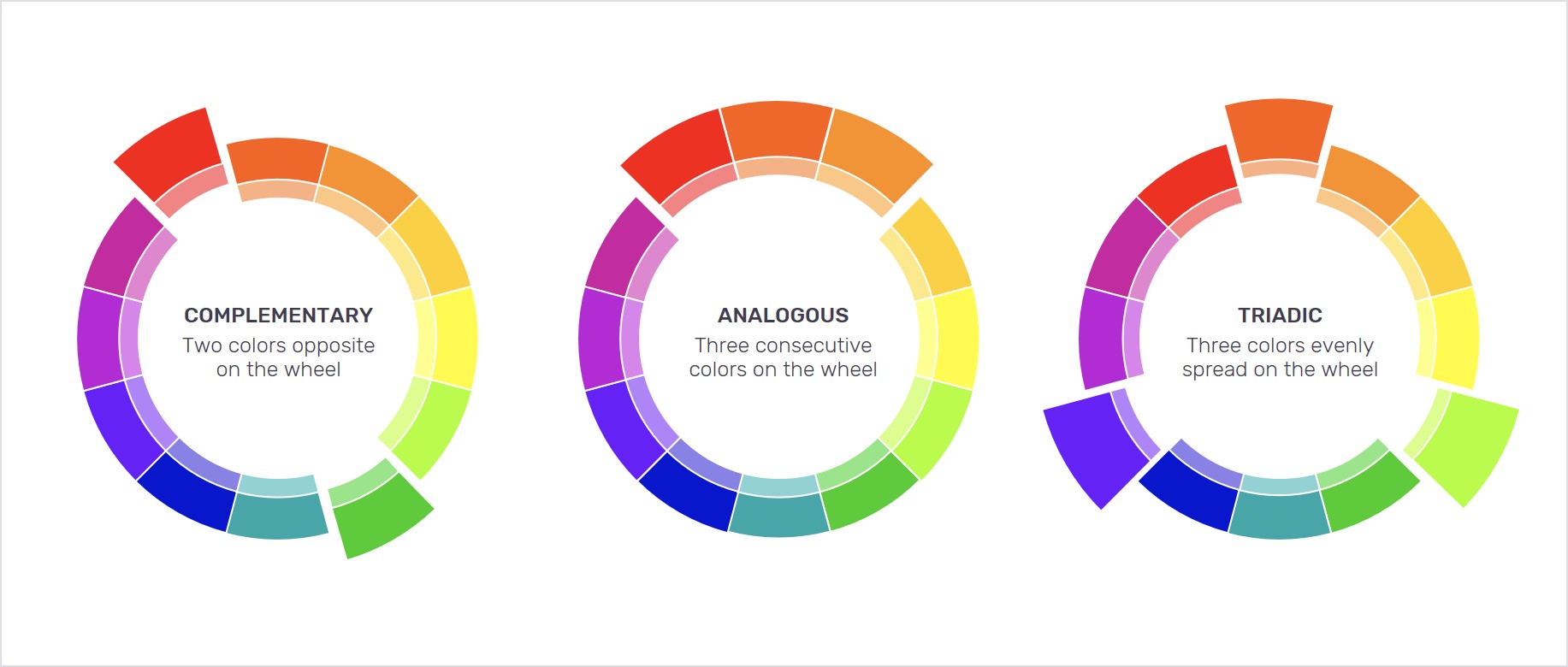
Using the color wheel
- Complementary colors are any two colors that appear opposite from each other on the color wheel. Using a complementary color scheme will help make your design pop and create clear differentiation.
- Analogous colors are any three colors that appear side by side on the color wheel. In this type of color scheme, one color dominates, one color supports, and the last color accents. These combinations tend to be visually pleasing and effective in communicating different types of information.
- Triadic colors are any three colors that are equally spaced around the wheel. They create a bright and dynamic presentation, giving your presentation contrast and harmony at the same time. Red and green fall together easily with this type of combination. Keeping in mind the frequency of red-green color blindness, try to avoid combining these two colors where you can.
The best color schemes for readability tend to be complementary or analogous colors. Canva has a great color wheel that will help you choose the type of scheme you want, and experiment with different color combinations.
Proper color contrast makes your presentation design more accessible
Contrast is how well one color stands out against another. A common misconception is that contrast is created by the difference in colors—but the tone of the colors is what makes the real difference in being able to see each color clearly. Tone is how a color looks when you add a shade of gray to it, making the color less vibrant.
You might choose two vastly different colors and still find that they do not stand out from each other the way you had hoped. This is likely because they are the same tone. An easy way to test how well your colors contrast each other is to put them into grayscale.
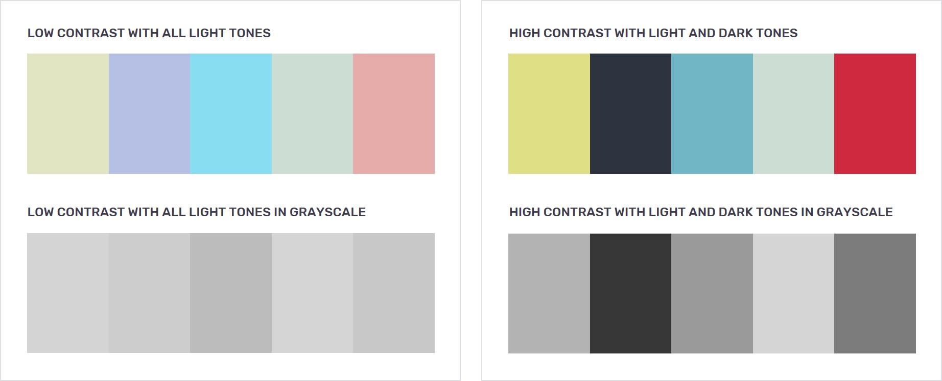
Generally, you want to go for high contrasted elements in your design because that is the easiest to see. Light text on a dark background or dark text on a light background will appear more clearly than light text on a light background or a dark text on a dark background.
However, be careful not to oversaturate your designs with high contrast elements. If everything is highly contrasted, nothing stands out anymore. Contrast is best used to emphasize a point, such as a call to action, or a word or phrase that needs to stand out from the rest.
Low contrasts tend to be pleasing to the eye, but they impede the readability of text and the visibility of your graphics. The key here is to find balance between a beautiful color scheme and one that works for optimal clarity.
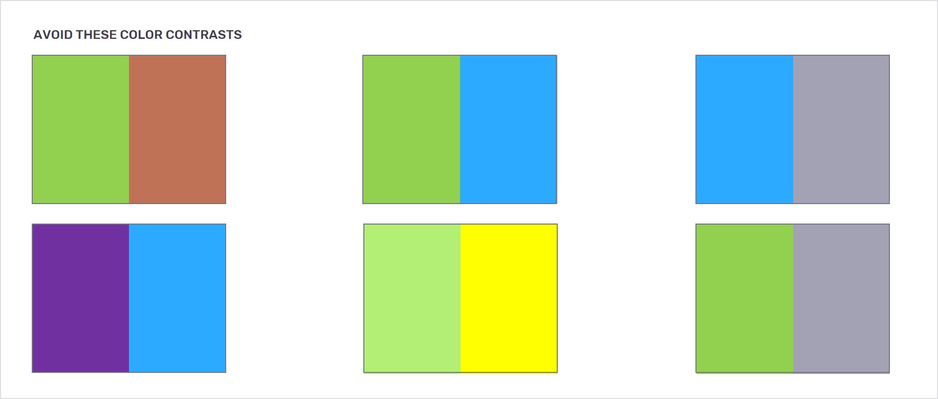
Since red-green color blindness is common, try to avoid this combination where you can. Some other combinations to be cautious with include: green and brown, green and blue, blue and gray, purple and blue, green and yellow, green and gray. These color combinations tend not to contrast well and it can be difficult to see a distinct difference between them, even for viewers without color blindness.
Contrast is especially important for text in a presentation. Text is an essential feature of any presentation, but it needs to be well contrasted against its background to be clearly legible to all audiences. Text is what provides the bulk of information in a presentation, so we want to make sure it doesn’t go undetected.
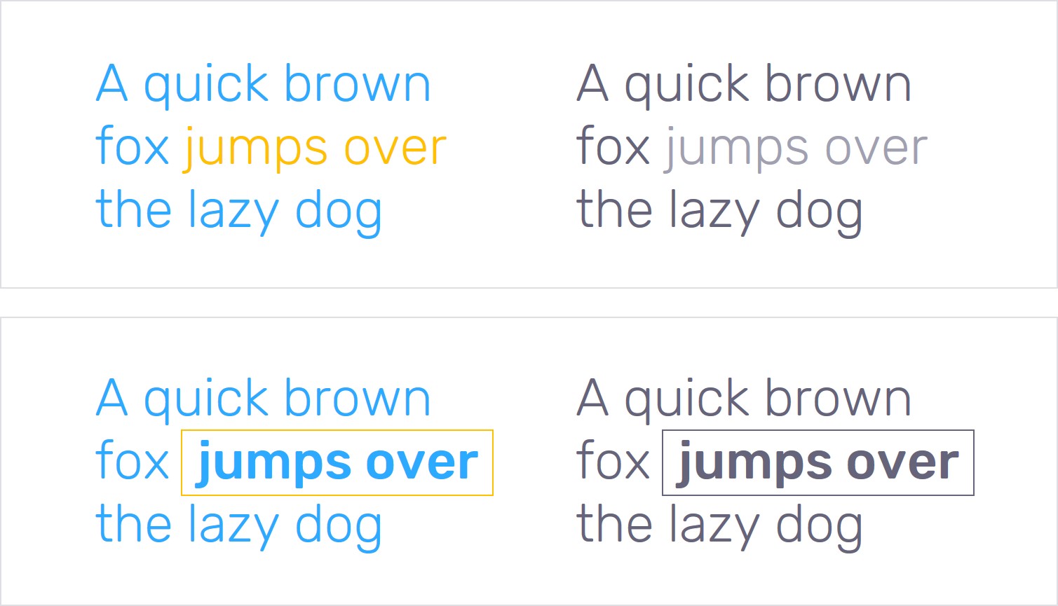
Besides contrast, our lead designers have some other tricks to emphasize text. One way is by giving the word or phrase being emphasized a different color from the rest of the text. Sometimes they will additionally place a thin box around the words to make it stand out even further.
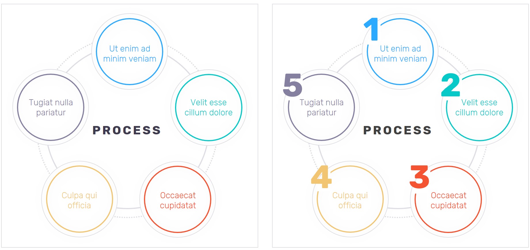
When itemizing lists or outlining processes, it’s helpful to use numbers to indicate hierarchy and the order in which you want your audience to read.
Select photographs that are highly contrasted
Photographs are other graphics where you want to keep contrast in mind, especially if you will be overlaying text. Take the time to select photos with good contrast and try to avoid those with too much white if you already have lighter colors in your design palette. Light colors tend to get washed out by natural lighting, projector lights, and other environmental factors that tend to be beyond your control—accommodate for this in your design.
Use symbols for additional emphasis
It is important to not rely on color alone to convey your messages or be the focus of your design. Subtle changes or differences in color may go unnoticed by those with color blindness or other visual impairments. Where possible, try to incorporate symbols to emphasize parts of the slide that need to be highlighted. This can mean underlining a word so that it stands out or putting a symbol next to the point you are currently focusing on. This helps guide your audience through each point as it is presented, and can help to minimize any confusion.
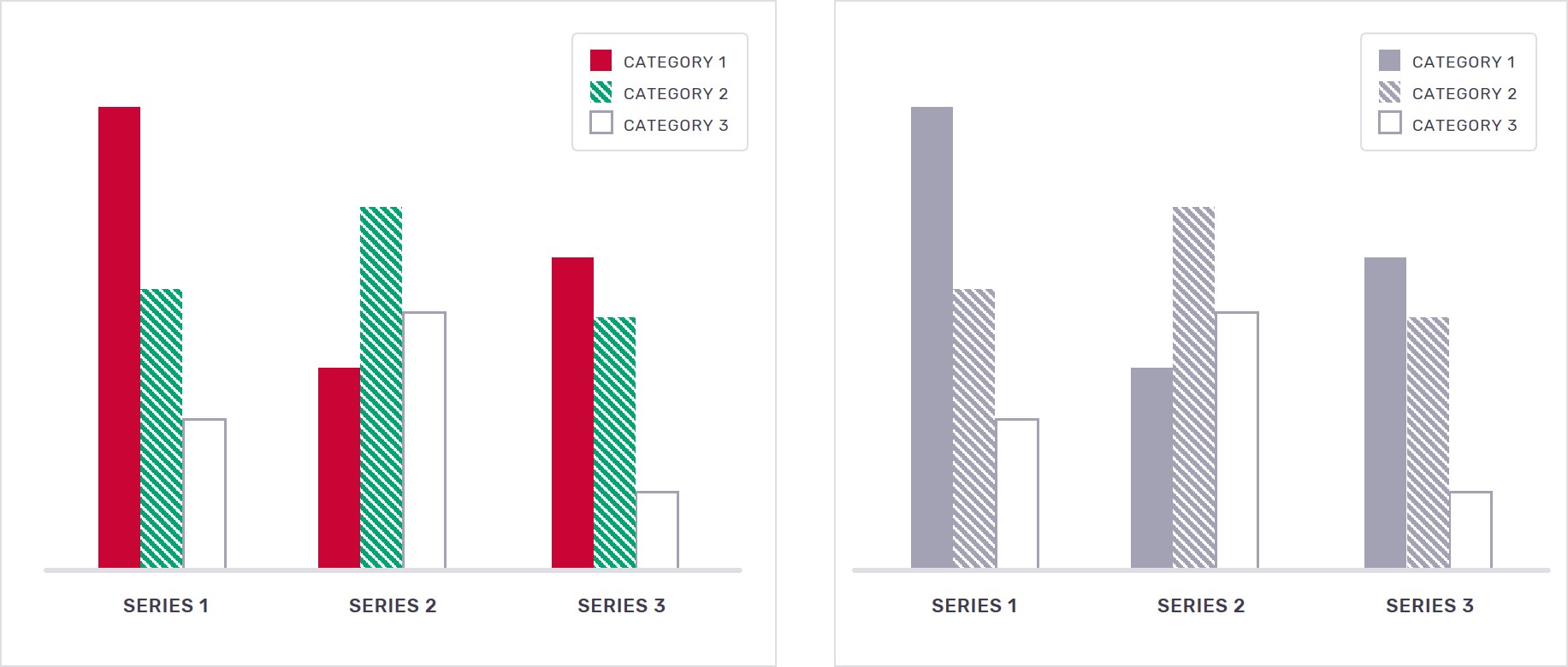
Include patterns and textures in your graphs
One of the most effective and accessible techniques for distinguishing between the different series within your graph is to use patterns in addition to colors. Using textures gives viewers an additional point of reference when comparing the cells of a graph with the graph’s respective legend. This way, even if the viewer finds the colors difficult to distinguish, the pattern will be a clear indication of what the graph is showing.
Additional resources for designing for color blindness
To ensure your presentation design is color accessible, there are resources you can use to see what your design would look like to someone with any type of color blindness.
- Color Oracle is a tool that will show you how your design appears to color blind viewers, as you design it.
- Color Review lets you check the contrast between two colors.
- Color Contrast Analyzer is a desktop tool that is available for download. It helps you determine the legibility of text and the visibility of visual elements.
- Color Shark is another quick way to check that the contrast between your colors is distinct enough to make for clear visibility and text readability.
How to design PowerPoint presentations to work with screen readers
When designing presentation decks that will be read by screen readers, the layout and order of objects on each slide are key to provide a meaningful experience to listeners.
Creating an appropriate layout for screen readers can be difficult to do, but it is very important to facilitate how the audience understands the information being presented. Layouts that are difficult to follow will result in screen readers doing a poor job of reading the slide, and consequently the listener will not gain any useful information. They will also miss out on the full experience of the presentation.
When screen readers read information out of order, listeners hear information that is not cohesive and consequently, carries little value or meaning. While screen reader users may not be able to see the design of your slides, the order of your content is still important to ensure a seamless progression through the content.
These tips will help you ensure your layouts are logical and compatible with how a screen reader will navigate through the content.
Organize content in a linear fashion
Screen readers go through each item on a slide from top to bottom, left to right. When organizing content on a slide, be sure that it flows linearly and logically. Put distinguishing information as early as possible in your slide so that listeners will know the key focus of the slide sooner. The most important information should be introduced as early as possible so that listeners know what each slide focuses on.
The Selection Pane in PowerPoint shows you the order in which a screen reader will navigate through your content. This can be found on the Home tab in the “Drawing” section; click on “Arrange” then “Selection Pane” to bring up the Selection side panel. Note that the screen reader will read this list of objects from the bottom to the top, so you want to make sure the title of the slide is at the bottom of this pane.
Another way to check if your slides are accessible to a screen reader is in the Review tab; click on “Check Accessibility”. This will point out which slides, and which items on those slides, are presenting an issue.
Writing alternative text for images
Alternative text (alt text) is what the screen reader reads to describe an image to the listener. It is also displayed in place of an image in case it cannot be loaded. Images that do not have alt text will either be ignored by screen readers or the image file name is read instead—either way, missing alt text often leaves users without useful pieces of information. If you have any images that are important for understanding the context of the slide, be sure to include alt text for each one.
Be descriptive
- Alt text should be clear and provide all the relevant information needed to understand what the image is. Here’s a good test for descriptiveness: close your eyes and have someone read the alt text to you. You should be able to picture a reasonably accurate version of the image and understand the key concept it conveys.
Keep it concise
- While it is important to be descriptive, your audience does not need unnecessary details. Additionally, most widely used screen readers cut off alt text at 125 characters. Focus on writing succinct alt text that sufficiently describes the image.
Identify the image’s purpose
- It is important to determine what purpose the image serves on your slide: is it informative or decorative?
- Alt text for informative images should not only describe the content of the image, but also make sense when read with its surrounding content.
- Decorative images exist on presentation slides for layout or aesthetic purposes and do not contain important information as it relates to the slide. For these images, you can leave out alt text—PowerPoint allows you to mark items as decorative so that screen readers know to ignore them.
Use proper punctuation
- Commas and periods in the alt text will cause the screen reader to ‘take a breath’, creating a more natural-sounding flow to the speech produced.
Use language that is appropriate to your audience
- Knowing your audience will help you discern which images need alt text and how complicated the text needs to be. If your slides are being shown to the general public, you should use layman terms and be as straightforward as possible. If your slides will be presented to industry professionals, you may use more technical descriptions that will provide additional meaning.
Creating alt text for grouped objects
There is a common misconception that grouped objects in PowerPoint do not need alt text, but this is not necessarily true.
When you have a heavily detailed graph, you will want to write alt text that explains the main takeaway. For example, if you are showing a company’s performance as it has increased over the last five years, you don’t need to write the statistics for every year—but you might write alt text that lets the audience know the graph shows an increase in sales over the last five years.
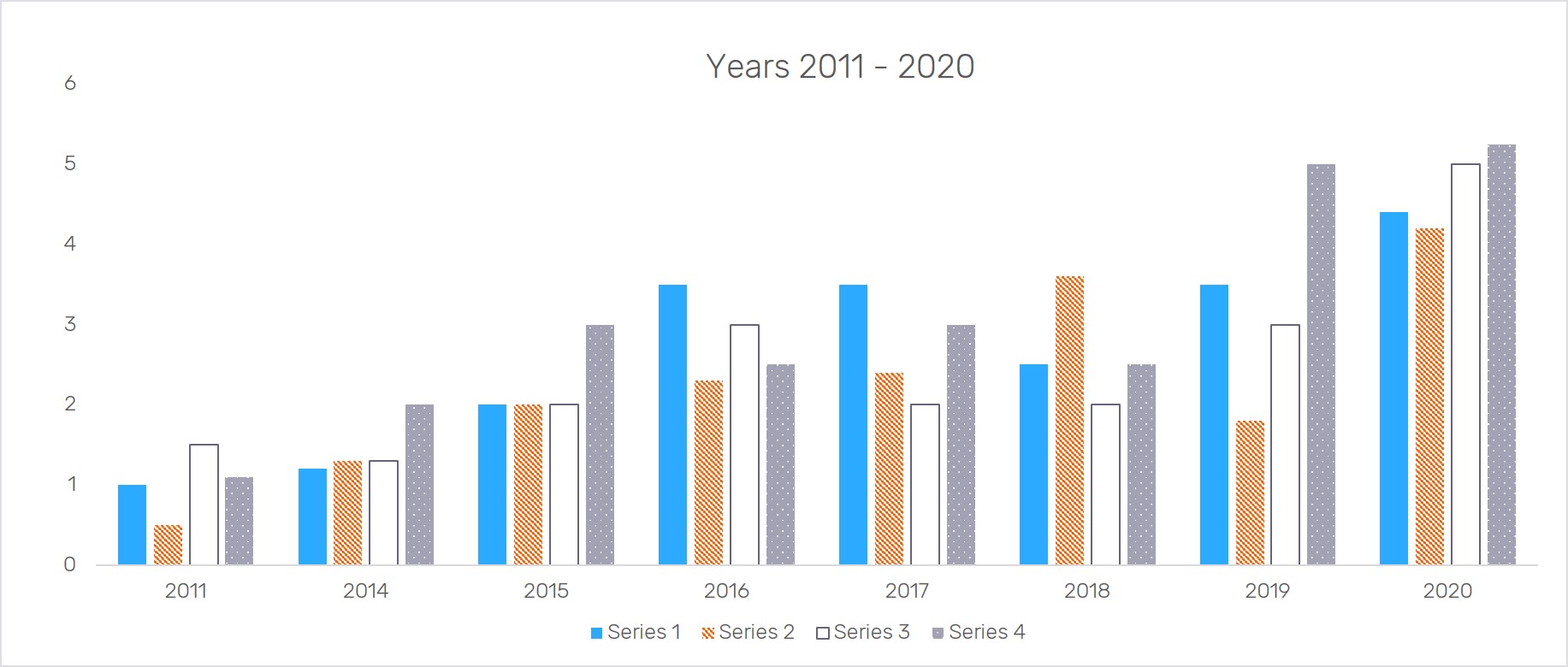
If you have a simple chart, you can write the data in the alt text as it concisely explains the chart's purpose. For example, a chart that shows 50% of customers prefer email contact and 50% prefer phone calls is straightforward but important nonetheless. Each piece of information is important on its own, so it is a good idea to include both stats in the alt text.

Writing alt text in PowerPoint
PowerPoint has an easy-to-use, built-in feature that allows you to add alt text for slide objects. You select the image, then right-click and select “Edit Alt Text”. Or, you can select the image and under the Picture Tools tab, select “Format” then “Alt Text”.
When marking items as a group, you will need to indicate that each of the individual aspects of the graph or image are decorative. In the alt text window in PowerPoint, you will have the option of setting decorative images. Click this option if you do not need to write alt text for the image.
If marking individual elements of a group, you can write text that easily explains what each element of the graph represents. Using the above example, if the section shows that 50% of people like emails, that is all you need to include in your alt text.
If the slide has text that already provides a sufficient description of the information presented in the chart or graph, you may not need to go in-depth with your alt text.
Design for people
While a large focus when writing alt text is for it to be screen reader friendly, do not lose sight of the fact that you are designing for the people in your audience. The photos used in your presentation should exhibit diversity, and that should carry over into the alt text.
Create hidden titles for “untitled” slides
In some cases, not all presentation slides need a designated title. Unfortunately, slides without titles will bring up an error message in PowerPoint. A workaround we use is to create a hidden title—simply put, it is a slide title that is moved outside of the slide workspace. It will be read by screen readers and will not appear during presentation show mode.
Since the title will be read by a screen reader, you want to provide a title that is informative to what the focus of the slide is.
Additional resources for screen reader accessibility
There are many resources available to help you understand how your designs will be interpreted by a screen reader. Since 2000, Windows comes with Microsoft Narrator pre-installed, which you can use to listen to how your PowerPoint presentation is designed and adjust for improved accessibility. The Mac equivalent is VoiceOver.
Conclusion
Designing for accessibility in all areas of life, should not feel any different from designing for any other audience. Adhering to good design practices and techniques will ensure that your designs are accessible and easy to follow, no matter who your audience is. If your company works with an external design agency, be sure to let them know that you want your designs to be considerate and accessible to all audiences. Stay up to date on ADA standards for design to ensure that you are protecting yourself and your company and creating slides that everyone can enjoy.


